Repository navigation
Conversation


 Hristo313
added
❌ status: awaiting-test

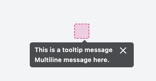
- Replace the inline-styled grid with a DoDont block; texts and alts unchanged
- Crop the Do/Don't images to the bare input and tooltip on a transparent
  backdrop, since DoDont draws the frame and badge
- Bump igniteui-astro-components to 1.6.0, the first release with DoDont

Co-Authored-By: Claude Opus 5.5 <noreply@anthropic.com>

Contributor
|
Review for Tooltip Component - React/ Chrome
|


IMinchev64
reviewed
Nov 2, 2026
 IMinchev64
added
💥 status: in-test
IMinchev64
added
✅ status: verified
This file contains hidden or bidirectional Unicode text that may be interpreted or compiled differently than what appears below. To review, open the file in an editor that reveals hidden Unicode characters.
Learn more about bidirectional Unicode characters
Sign up for free
to join this conversation on GitHub.
Already have an account?
Sign in to comment


Add this suggestion to a batch that can be applied as a single commit.This suggestion is invalid because no changes were made to the code.Suggestions cannot be applied while the pull request is closed.Suggestions cannot be applied while viewing a subset of changes.Only one suggestion per line can be applied in a batch.Add this suggestion to a batch that can be applied as a single commit.Applying suggestions on deleted lines is not supported.You must change the existing code in this line in order to create a valid suggestion.Outdated suggestions cannot be applied.This suggestion has been applied or marked resolved.Suggestions cannot be applied from pending reviews.Suggestions cannot be applied on multi-line comments.Suggestions cannot be applied while the pull request is queued to merge.Suggestion cannot be applied right now. Please check back later.
Closes #719
Update the Tooltip xplat topics
Also updated the samples:
Angular -> IgniteUI/igniteui-angular-samples#4060
React -> IgniteUI/igniteui-react-examples#1129
WC -> IgniteUI/igniteui-wc-examples#1304
Blazor -> IgniteUI/igniteui-blazor-examples#1335
Checklist:
preview/beta./page.mdxor../relative/path.mdx(.mdxextension required)IgxSelectComponent,<igx-combo>code blocksfor the names of classes / tags / propertiescode blockscheck-api/mdxnpm commandsllms.descriptionmetadata and runnpm run check:llms-metadata